Executive Resume Strategy: Pair Effective Content with Innovative Design
Last week an executive approached me to engage my services in the development of a new resume and cover letter to support his upcoming c-level search. In his initial communications he shared (in his exact words) that:
“ I do not like flashy resumes. I prefer effective, intelligent, – yet innovative – presentations.”
I appreciated this straightforward comment. Why? Because he did not want an ostentatious or showy career file, but he also didn’t want a boring resume. He wanted something innovative and unique.
For me, pairing effective content with an innovative presentation is a strategy that all executive-level resumes should aspire to achieve.
When it comes to writing a good resume there is often debate on where to put focus during compilation – should the emphasis be placed on a stand-out design and format, or is the majority of time best spent on developing stellar content?
Ultimately a resume is only as good as the content within it – which should include a unique value proposition, career highlights, specific results, and the skills required for the targeted role. Employers need to know – very explicitly – how a job seeker is a good match for their requirements, and this is shared in the resume details. However, how you share content in a resume also matters. Although ‘content is king’ in a resume, the look and flow of the document should be awarded appropriate attention.
Executive resumes often act as a first impression, and first impressions are often made by appearance alone. Have you ever found yourself skimming a handout, brochure, or poster and being completely engaged in the material because it was both easy to follow AND informative? Your executive resume needs a similar appeal. Lay out content strategically to capture and keep the attention of the reader. Guide reader’s eyes through career impacts; leaving no questions unanswered and no doubt about the value presented. Intelligent content paired with innovative presentation.

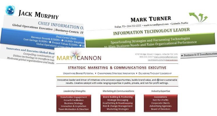
Innovative and High-Impact Resume Design Sample
When a request is made to pair bold, authentic career content in a format that is both appealing and awarding….it’s like music to my ears! For some, the design will be stronger…for others, more subtle. The two should work strategically together.
The next time you sit down to work on your executive resume – remember that although the content of your resume is critical, give the presentation careful consideration. Keep your executive resume packed with relevant, quantitative results that clearly position you as the candidate of choice. Further appeal to the reader with a clean and professional format comprised of clear headings and sections, proper white space, suitable design features, and yes even a bit of unique, innovative flair to help it stand apart in a sea of competitors – all with the target audience in mind.
Note: Resume design does not matter in an ATS (Applicant Tracking System), but you should always have a ‘human-eye’ friendly resume for in-person distribution because networking is the #1 way to secure executive-level employment!
View More Award-Winning Resume Designs at: www.CareerImpressions.ca


You stated design doesn’t matter in ATS, but I often am gun shy if suggesting anything creative in the headline, for fear it won’t be read correctly, or worse, be totally kicked. Since resumes should be tailored for each job, are you suggesting to use the creative for use with ATS, or to make 2 resumes, 1 creative, 1 ATS, for each position? Just wanting to clarify. Thank you!
Great questions Cherie. When applying online, it is always important to keep the system in mind. Adding something like colour or shading to words or section lines should not impact resume performance in ATS. Fancy graphics or text boxes likely won’t be ‘seen’, but there are still ways to include them. If someone is unsure about how design may impact results, then 2 resume formats are a great option. A nicer, fancier format for in-person distribution and a more simplified version of the file for online applications.